The Problem
The Redesign of the HGTV.com web site originated in the need for a new platform- the existing CMS was antiquated at best. Each of the brand sites (HGTV being one) was operating off a different version of the existing platform which meant that, in order for a feature to be implemented on each site, it had to be developed and deployed to each site individually Not only that, but in order to program content, and editor needed to understand the inconsistencies between sites.
Starting in 2013, the Product Design Team (including me) started on a journey to accomplish the task of “platform consolidation”, which means we started from the ground up. It meant a new taxonomy, a new platform, new modules and features, new content strategy, new ways to engage the audience, and new ways to monetize the site. It meant new ways to manage and publish content and new device support.
My role was to lead the Information Architecture, design of show/host related experiences and lead the mobile UX.

The Journey
Because we had a long history of site usage, we started with the question “What kind of content are people consuming at?” To answer this question we spent several months looking at analytics to uncover key words, natural search terms, site search terms and other data. the data we collected was analyzed and terms were subsequently cataloged on a series of post-it notes.The post-its were arranged on whiteboards so we could move the project from place to place as needed, but also so we could make notes and capture observations.
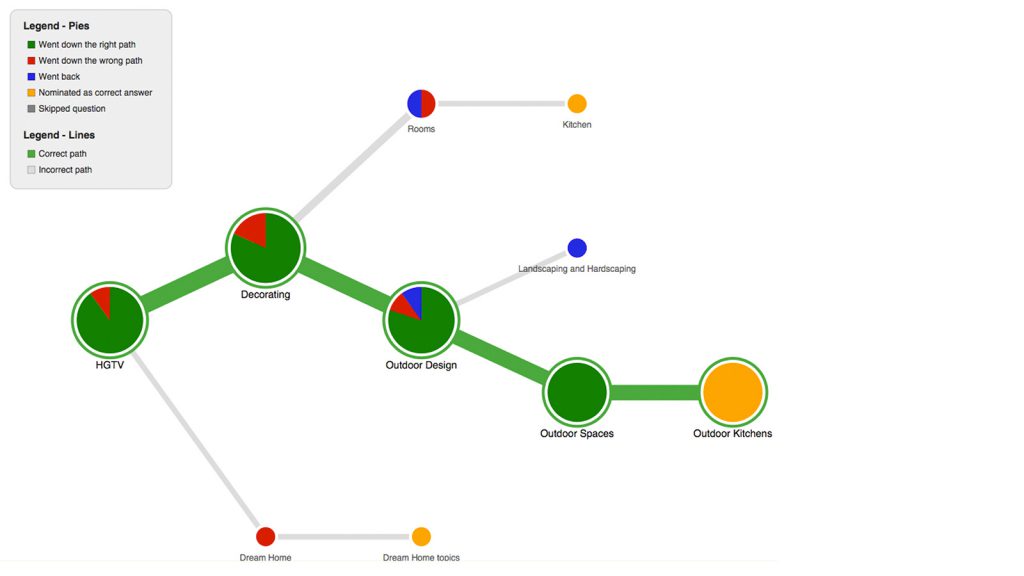
When the initial research was complete, we created a series of flow diagrams. We not only needed buy-in form key stake holders but we needed to test our observations with real people. to do that, we id a series of reverse card sorts (tree sorts) to see if people were thinking about the organization of terms in the same or similar ways to us.
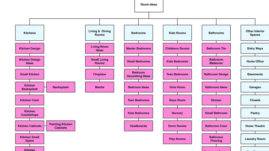
The end result was a series of flow diagrams that illustrated the hierarchy of parts and terms as well as a spreadsheet of terms to be applied to the site.

